IPEDS Low-Income Students Infographic
A Look at Public Institutions by Net Price for Low-Income Students and Six-Year Graduation Rate
| % FTFT UG w/ Pell | Average Net Price for Low Income | 6-Year Grad Rate | |
| ISU | 53 | 8,220 | 42 |
| Overall Mean (Excludes ISU) | 43.4 | 9,835 | 46.3 |
| Indiana Mean (Excludes ISU) | 39.9 | 8,341 | 34.2 |
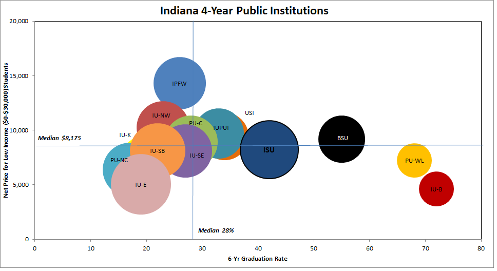
The bubble charts provide a visual of where low-income students are attending college. The charts give three aspects to consider:
- How many low-income students does the institution serve
- What is the financial burden for these students
- How many of its students graduate within six years
- The size of the bubble represents the percentage of first-time, full-time students who receive Pell Grants at the institution.
- The horizotal axis is the overall six-year graduation rate.
- The vertical axis is the institution’s annual net price for first-time, full-time students who receive Title IV financial assistance and come from families earning between $0 and $30,000 per year. (Net Price equals the total cost of attendance minus the average grant aid received.)
- The chart had four quadrants, created by the median of each axis. Institutions in the bottom-right portion of the chart have high graduation rates and low net price. Institutions in the top-left quadrant have low graduation rates and high net price. Institutions in the upper right quadrant have high graduation rates but a higher net price, while those in the lower left offer a low net price, but lower graduation rates.
Chart Idea: The Education Trust

Data Source: NCES IPEDS 2012-13 data (Institutional Characteristics, Graduation Rates Survey, Financial Aid Survey)
Contact
Institutional Research
Rankin Hall
Indiana State University
P: 812.237.2305
F: 812.237.4530